Silhouette Studio offers a variety of text feature options and other software tools to manipulate your text appearance.
Font Style Preview
One of the most important decisions when using text is selecting the right font.
Though you can of course see the basic style represented by looking at the font list, you can also have the font list display a specific word to preview how it would specifically look in that font option.
To use this feature:
- Open the Text Style panel
- Click in the box labeled "Enter preview text here" (below the font list)
- Type a word you'd like to preview
The font list will be updated to show your word in each font style as you scroll through the list.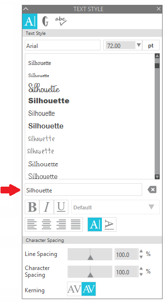
To turn this off and revert to the actual font names, press the 'delete' icon to the right of the preview text field.

Making Text Thicker
To thicken text letters, you can either:
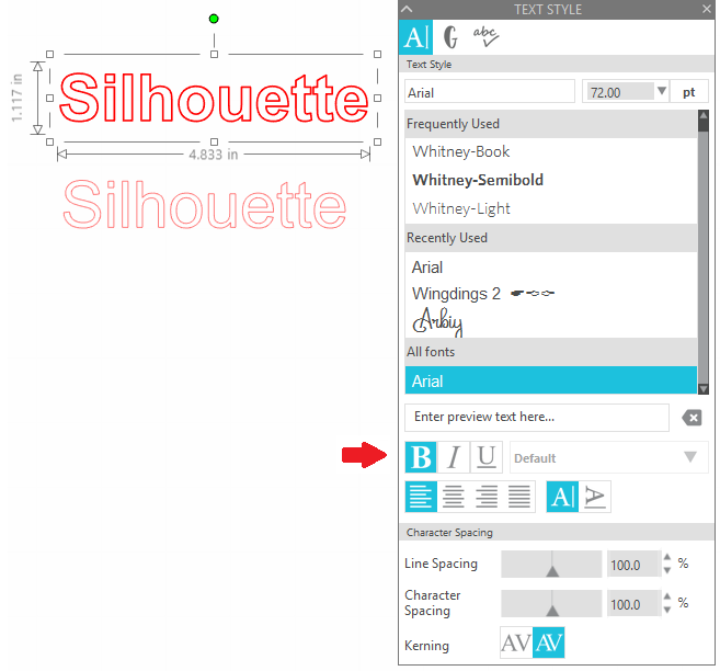
- Use the Bold option in the Text Style panel
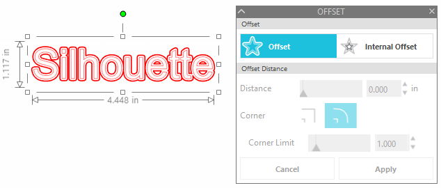
- Use the Offset feature
Curved Text / Text to Path
The 'Text to Path' feature allows you to place text along a curve to create an arced effect.
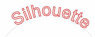
To create this effect:
- Create a circle, arc, or other curved image
NOTE: In the example above, the Arc tool was used
- Create the desired text
- While in the Text Editing mode (where the text is surrounded by a green editing box), locate the small control point on the lower left-hand side of the text box
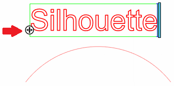
- Click and hold down on this control point
- Move your text control point onto the desired line
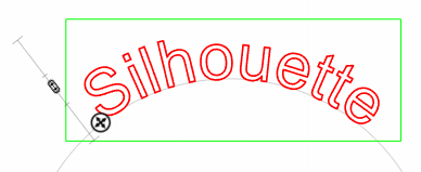
NOTE: This feature can be used to drag text onto any line path, but works best when using an arced or circle pattern - Use the vertical control point (to the left of your text) to set the text into position above, along, or below the line in order to acheive the desired look.

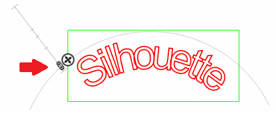
NOTE: The line or object your text is placed on will automatically turn off any cutting or other action for that line or object.
Vertical Text
Text is defaulted to create horizontally (left to right), but can be adjusted to create vertical text.
To create vertical text:
- Go to the Text cursor tool
- Create your text in the desired font style
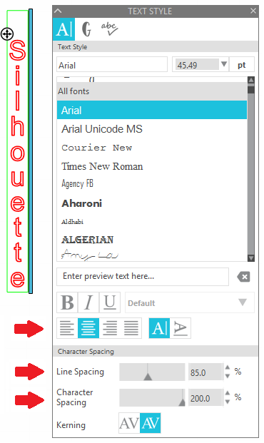
- While still in the text edit mode (with the green box around the text), click on the black bar (to the right of the text) and drag it to the left (back towards the first letter of your text)
- If there are any lines showing two letters on the same line, place your cursor in front of the second letter on that line and press the Enter key on your keyboard to move it onto its own line
- In the Text Style settings, select the Center option, and adjust the Line Spacing and Character Spacing to your liking
Kerning
Kerning is the spacing between individual characters. Unlike the 'Character Spacing' option, which adjusts the amount of space between characters accross the entire selected word in equal increments, kerning adjusts each character individually in order to create the most visually pleasing spacing for that specific font style.
The Kerning feature in the Text Style options can be toggled on to control character kerning for fonts that have such available.

When Kerning is toggled on, the spacing between each letter is fine tuned according to the data provided by the font author. Pairs of letters which fit nicely together will be moved closer together.
For example:
- If a letter 'A' is followed by letter 'V', then kerning moves these letters closer because 'AV' fist together nicely.
- If letter 'A' is followed by letter 'M', these letters do not fit together particularly well, so kerning might not typically adjust these two letters.
NOTE: Kerning information is stored inside the font file; it is not computed by Silhouette Studio. Therefore, the specific adjustments applied by kerning depend completely upon the values defined by the font author.
